Dead Simple
Type: Product Design Internship, Summer 2020
Duration: 10 weeks
My Role: User Research, UX Design, Visual Design
My Impact: I helped realize the first ever iteration of the product.
Tools: Figma
Note: Out of respect for confidentiality, I cannot share certain details online since the product has not yet been released! Do reach out to me to learn more :)

What’s Dead Simple?
Dead Simple is a pre-seed stage startup that seeks to help young adults get organized, stay informed, and keep track of the juggling act of adulting, so that they can focus on living life.
What’s the problem?
Over the duration of the internship I focussed on one use case of “adulting” - buying a car. The process is complex and confusing, especially for a first time buyer, and several factors that need to be considered.
What’s the solution?
A playful product that walks the user through the process of buying a car. Key features include clustered task lists, social sharing to divide the burden, and inbuilt widgets to support decision making.
Key Features
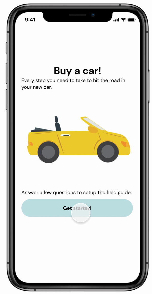
1. Questionnaire
A few multiple choice questions to personalize the field guide for the users situation

4. Files and Sharing
Easy access to relevant documents and multiple collaboration options to share the load

2. Dashboard
An overview of progress, documents associated with the project and people involved

5. Getting help
Access to live support and answers to commonly asked questions

3. Tasks
To-Do’s containing clusters of related tasks and guidance on how to complete them

6. Celebration!
Completing the project with a sense of accomplishment and excitement
Micro-interactions
Focussing on micro interactions made room to explore an additional dimension of the users experience. It was particularly important for this product as we try to make a difficult task feel more like an adventure.

Visualizing Progress Constantly updating a progress bar at the top and “collapsing” sets of tasks that have already been completed in an attempt to switch focus to what’s left.

Celebrations An engaging animation after completing the project to act as an element of encouragement and excitement.
Business Opportunities
To ensure product viability it was important to identify ways to drive revenue without impacting the customer experience.

Design Challenges

Making a complex process seem linear
Many factors and decisions are involved with buying a car. The goal is to organize information in a way that a user perceives it as linear rather than overwhelming.

Scalability across use cases
I worked on only one use case of the product i.e. buying a car, but the products projected capabilities extend beyond that. This meant that I needed to design a framework that could easily be adapted to different problem spaces while still providing a user with enough detail.
How much guidance is too much?
It was important to never tell the user what to do - their circumstances and preferences determine what’s best for them! Instead, we needed to focus on making them aware of decisions that they need to make.


Dealing with ambiguity
I worked on the first ever version of the product. Not having previous iterations to build upon was difficult and I found it particularly challenging to create intuitive information architecture. I would frequently stumble upon edge cases that required me to backtrack, make changes, and start again.
Design Process

Performance Metrics
Although the project wasn’t shipped during my internship, here are a few parameters that could be used to measure success. Studying them would provide insights into how to improve the product going forward.
Completion rates
Of all the users that start the process of buying a car using our product, how many actually finish it through the app? How long does it take?
Common Speedbumps
If we notice that users frequently get stuck at a certain task we will be able to dig deeper and find out why, resulting in decreased time to value.
Use of “Help”
How often is a user unable to find required information in a field guide? What additional help do they seek? This information could help determine how to improve the field guides.
Next Steps
If I had stayed on at the company for a longer period of time, these are a few things I would have done next -
User Testing
The prototype would need to be tested for user flow and interactions as well as content and level of detail in the guides.
Visual Design
There is scope for the visual aspects to be polished further before developer hand off.
More Use Cases
Designing for different use cases may raise challenges about how to adapt the guide format to be consistent yet flexible.
Figuring out nuances
How does one reset a guide? Will there be integrations with existing products? Can stakeholders get involved?
MORE PROJECTS

Personalizing Pins

Faim

Forest